

Building a Stunning Habit Tracker with Visual Progress Rings
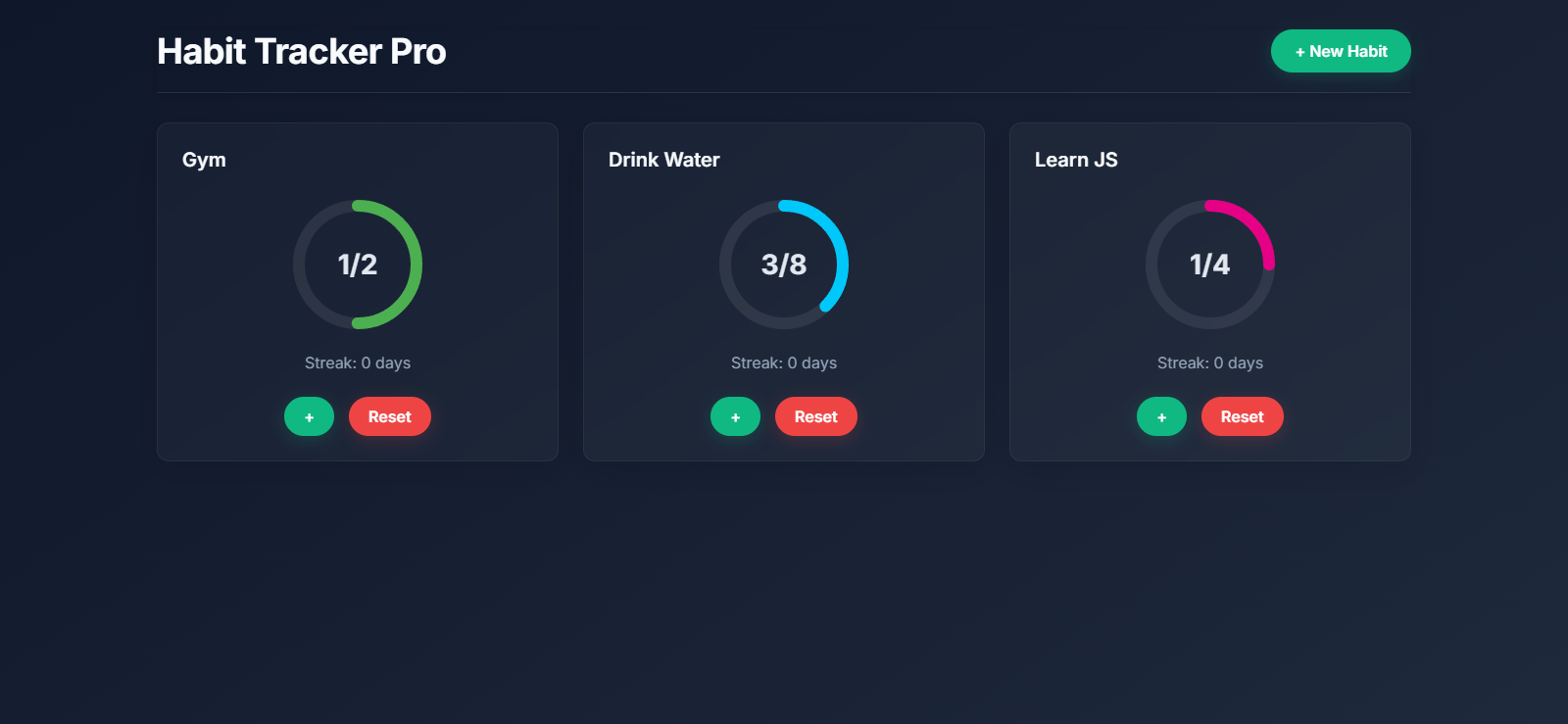
Have you ever wanted to build a beautiful, interactive habit tracker that keeps you motivated with visual feedback? In this tutorial, I'll walk you through creating a sleek habit tracking app with circular progress indicators and streak counters that help visualize your daily progress.
Check out the app here - https://playground.learncomputer.in/habit-tracker/
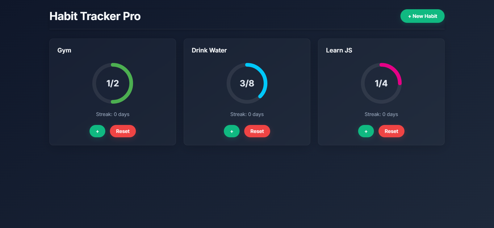
What We're Building 🚀
Our Habit Tracker Pro app allows users to:
Create custom habits with personalized names, goals, and colors
Track daily progress with visually appealing circular progress rings
Monitor streaks to stay motivated
Save data locally so progress persists between sessions
You can check out the live demo here to see the final product in action.
Project Structure
Before diving into the code, let's understand our project structure:
HTML: Creates the structure and layout of our application
CSS: Styles our app with a modern dark theme and smooth animations
JavaScript: Handles the application logic, data storage, and UI updates
Setting Up the HTML 📄
Let's start by creating the HTML structure for our habit tracker. Our HTML will provide the basic scaffolding for the app, including:
A header with the app title and "New Habit" button
A grid to display all habit cards
A modal for adding new habits
Let's break down what we've created:
We've set up the basic document structure with proper meta tags and linked our CSS and fonts
Our container has a header with a title and "New Habit" button
An empty
divwith IDhabitsGridwill serve as the container for our habit cardsWe've included a modal with a form to add new habits
The form collects habit name, daily goal count, and color preference
<!DOCTYPE html>
<html lang="en">
<head>
    <meta charset="UTF-8">
    <meta name="viewport" content="width=device-width, initial-scale=1.0">
    <title>Habit Tracker Pro</title>
    <link rel="stylesheet" href="styles.css">
    <link href="https://fonts.googleapis.com/css2?family=Inter:wght@400;600;700&display=swap" rel="stylesheet">
</head>
<body>
    <div class="container">
        <header>
            <h1>Habit Tracker Pro</h1>
            <button class="add-habit-btn" onclick="showAddHabitModal()">+ New Habit</button>
        </header>

        <div class="habits-grid" id="habitsGrid"></div>

        <!-- Add Habit Modal -->
        <div class="modal" id="addHabitModal">
            <div class="modal-content">
                <span class="close" onclick="hideAddHabitModal()">×</span>
                <h2>Add New Habit</h2>
                <form id="habitForm">
                    <input type="text" id="habitName" placeholder="Habit Name" required>
                    <input type="number" id="habitGoal" placeholder="Daily Goal" min="1" required>
                    <input type="color" id="habitColor" value="#4CAF50">
                    <button type="submit">Add Habit</button>
                </form>
            </div>
        </div>
    </div>
    <script src="script.js"></script>
</body>
</html>
Styling with CSS 🎨
Now let's create the visual style for our app. Our design uses a modern dark theme with a gradient background, glass-like cards, and smooth animations for a polished user experience.
Our CSS creates:
A beautiful dark gradient background that gives the app a modern look
Responsive grid layout that adjusts based on screen size
Glass-morphism style cards with subtle hover effects
Custom styled progress rings for visual feedback
Smooth animations for adding habits and updating progress
An elegant modal for adding new habits
* {
    margin: 0;
    padding: 0;
    box-sizing: border-box;
    font-family: 'Inter', sans-serif;
}

body {
    background: linear-gradient(145deg, #0f172a, #1e293b);
    min-height: 100vh;
    color: #e2e8f0;
    padding: 30px;
}

.container {
    max-width: 1280px;
    margin: 0 auto;
}

header {
    display: flex;
    justify-content: space-between;
    align-items: center;
    padding-bottom: 20px;
    border-bottom: 1px solid rgba(255, 255, 255, 0.1);
    box-shadow: 0 2px 10px rgba(0, 0, 0, 0.2);
}

h1 {
    font-size: 2.25rem;
    font-weight: 700;
    letter-spacing: -0.5px;
    color: #f8fafc;
}

.add-habit-btn {
    padding: 12px 24px;
    background: #10b981;
    border: none;
    border-radius: 50px;
    color: white;
    font-size: 1rem;
    font-weight: 600;
    cursor: pointer;
    transition: all 0.3s ease;
    box-shadow: 0 4px 15px rgba(16, 185, 129, 0.2);
}

.add-habit-btn:hover {
    transform: translateY(-2px);
    background: #059669;
    box-shadow: 0 6px 20px rgba(16, 185, 129, 0.3);
}

.add-habit-btn:active {
    animation: pulse 0.2s ease;
}

.habits-grid {
    display: grid;
    grid-template-columns: repeat(auto-fill, minmax(320px, 1fr));
    gap: 25px;
    padding-top: 30px;
}

.habit-card {
    background: rgba(255, 255, 255, 0.03);
    border: 1px solid rgba(255, 255, 255, 0.05);
    border-radius: 12px;
    padding: 25px;
    backdrop-filter: blur(12px);
    box-shadow: 0 8px 32px rgba(0, 0, 0, 0.15);
    animation: fadeIn 0.5s ease;
    transition: transform 0.3s ease, box-shadow 0.3s ease;
}

.habit-card:hover {
    transform: translateY(-5px);
    box-shadow: 0 12px 40px rgba(0, 0, 0, 0.2);
}

.habit-header {
    display: flex;
    justify-content: space-between;
    align-items: center;
    margin-bottom: 25px;
}

.habit-name {
    font-size: 1.25rem;
    font-weight: 600;
    color: #f8fafc;
}

.progress-ring {
    position: relative;
    width: 140px;
    height: 140px;
    margin: 0 auto;
}

.circle-bg {
    fill: none;
    stroke: rgba(255, 255, 255, 0.08);
    stroke-width: 12;
}

.circle-progress {
    fill: none;
    stroke-linecap: round;
    stroke-width: 12;
    transform: rotate(-90deg);
    transform-origin: 50% 50%;
    transition: stroke-dashoffset 0.6s ease-in-out;
    animation: ringGrow 0.8s ease-out;
}

.progress-text {
    position: absolute;
    top: 50%;
    left: 50%;
    transform: translate(-50%, -50%);
    font-size: 1.75rem;
    font-weight: 700;
    color: #e2e8f0;
}

.streak {
    text-align: center;
    margin-top: 20px;
    font-size: 1rem;
    font-weight: 400;
    color: #94a3b8;
}

.controls {
    display: flex;
    justify-content: center;
    gap: 15px;
    margin-top: 25px;
}

.btn {
    padding: 10px 20px;
    border: none;
    border-radius: 50px;
    font-size: 1rem;
    font-weight: 600;
    cursor: pointer;
    transition: all 0.3s ease;
}

.btn-increment {
    background: #10b981;
    color: white;
    box-shadow: 0 4px 15px rgba(16, 185, 129, 0.2);
}

.btn-increment:hover {
    background: #059669;
    transform: translateY(-2px);
    box-shadow: 0 6px 20px rgba(16, 185, 129, 0.3);
}

.btn-reset {
    background: #ef4444;
    color: white;
    box-shadow: 0 4px 15px rgba(239, 68, 68, 0.2);
}

.btn-reset:hover {
    background: #dc2626;
    transform: translateY(-2px);
    box-shadow: 0 6px 20px rgba(239, 68, 68, 0.3);
}

/* Modal Styles */
.modal {
    display: none;
    position: fixed;
    top: 0;
    left: 0;
    width: 100%;
    height: 100%;
    background: rgba(0, 0, 0, 0.8);
    align-items: center;
    justify-content: center;
}

.modal-content {
    background: #1e293b;
    padding: 30px;
    border-radius: 12px;
    width: 450px;
    max-width: 90%;
    animation: fadeIn 0.3s ease;
    box-shadow: 0 10px 40px rgba(0, 0, 0, 0.3);
}

.close {
    float: right;
    font-size: 1.75rem;
    font-weight: 600;
    color: #94a3b8;
    cursor: pointer;
    transition: color 0.2s;
}

.close:hover {
    color: #e2e8f0;
}

h2 {
    font-size: 1.5rem;
    font-weight: 600;
    margin-bottom: 20px;
    color: #f8fafc;
}

form {
    display: flex;
    flex-direction: column;
    gap: 20px;
}

input {
    padding: 12px;
    border: 1px solid rgba(255, 255, 255, 0.1);
    border-radius: 8px;
    font-size: 1rem;
    background: rgba(255, 255, 255, 0.05);
    color: #e2e8f0;
}

input:focus {
    outline: none;
    border-color: #10b981;
    box-shadow: 0 0 5px rgba(16, 185, 129, 0.3);
}

input[type="color"] {
    padding: 5px;
    height: 50px;
    cursor: pointer;
}

button[type="submit"] {
    padding: 12px;
    background: #10b981;
    border: none;
    border-radius: 8px;
    color: white;
    font-size: 1rem;
    font-weight: 600;
    cursor: pointer;
    transition: all 0.3s ease;
}

button[type="submit"]:hover {
    background: #059669;
    transform: translateY(-2px);
}

/* Animations */
@keyframes fadeIn {
    from { opacity: 0; transform: translateY(20px); }
    to { opacity: 1; transform: translateY(0); }
}

@keyframes ringGrow {
    from { stroke-dashoffset: 314; }
}

@keyframes pulse {
    0% { transform: scale(1); }
    50% { transform: scale(0.95); }
    100% { transform: scale(1); }
}
Key Style Components
Progress Rings
The circular progress indicators are built using SVG. We create two circles:
A background circle that shows the total goal
A foreground circle that fills up based on progress
These rings automatically update as users log their progress, creating a satisfying visual representation of habit completion.
Animations
Notice the smooth animations throughout the interface:
Cards fade in when added
Progress rings animate when updated
Buttons have hover and active states for better interactivity
JavaScript Implementation 💻
Now let's implement the functionality with JavaScript. We'll create two main classes:
Habit- Represents a single habit with properties like name, goal, progress, etc.HabitTracker- Manages all habits and handles rendering, saving, and updating
class Habit {
    constructor(name, goal, color, id) {
        this.name = name;
        this.goal = goal;
        this.progress = 0;
        this.streak = 0;
        this.color = color;
        this.id = id;
        this.lastCompleted = null;
    }
}

class HabitTracker {
    constructor() {
        this.habits = JSON.parse(localStorage.getItem('habits')) || [];
        this.renderHabits();
        document.getElementById('habitForm').addEventListener('submit', (e) => this.addHabit(e));
    }

    addHabit(e) {
        e.preventDefault();
        const name = document.getElementById('habitName').value;
        const goal = parseInt(document.getElementById('habitGoal').value);
        const color = document.getElementById('habitColor').value;
        const id = Date.now();

        const habit = new Habit(name, goal, color, id);
        this.habits.push(habit);
        this.saveHabits();
        this.renderHabits();
        hideAddHabitModal();
        e.target.reset();
    }

    incrementProgress(id) {
        const habit = this.habits.find(h => h.id === id);
        if (habit.progress < habit.goal) {
            habit.progress++;
            this.updateStreak(habit);
            this.saveHabits();
            this.renderHabits();
        }
    }

    resetProgress(id) {
        const habit = this.habits.find(h => h.id === id);
        habit.progress = 0;
        habit.streak = 0;
        habit.lastCompleted = null;
        this.saveHabits();
        this.renderHabits();
    }

    updateStreak(habit) {
        const today = new Date().toDateString();
        if (habit.progress === habit.goal) {
            if (habit.lastCompleted) {
                const lastDate = new Date(habit.lastCompleted);
                const diff = Math.floor((new Date() - lastDate) / (1000 * 60 * 60 * 24));
                if (diff === 1) habit.streak++;
                else if (diff > 1) habit.streak = 1;
            } else {
                habit.streak = 1;
            }
            habit.lastCompleted = today;
        }
    }

    saveHabits() {
        localStorage.setItem('habits', JSON.stringify(this.habits));
    }

    renderHabits() {
        const grid = document.getElementById('habitsGrid');
        grid.innerHTML = '';
        this.habits.forEach(habit => {
            const percentage = (habit.progress / habit.goal) * 100;
            const circumference = 2 * Math.PI * 60; // Increased radius to 60
            const offset = circumference - (percentage / 100) * circumference;

            const card = `
                <div class="habit-card">
                    <div class="habit-header">
                        <span class="habit-name">${habit.name}</span>
                    </div>
                    <div class="progress-ring">
                        <svg width="140" height="140">
                            <circle class="circle-bg" cx="70" cy="70" r="60"></circle>
                            <circle class="circle-progress" cx="70" cy="70" r="60"
                                stroke="${habit.color}"
                                stroke-dasharray="${circumference}"
                                stroke-dashoffset="${offset}">
                            </circle>
                        </svg>
                        <div class="progress-text">${habit.progress}/${habit.goal}</div>
                    </div>
                    <div class="streak">Streak: ${habit.streak} days</div>
                    <div class="controls">
                        <button class="btn btn-increment" onclick="tracker.incrementProgress(${habit.id})">+</button>
                        <button class="btn btn-reset" onclick="tracker.resetProgress(${habit.id})">Reset</button>
                    </div>
                </div>
            `;
            grid.innerHTML += card;
        });
    }
}

const tracker = new HabitTracker();

function showAddHabitModal() {
    document.getElementById('addHabitModal').style.display = 'flex';
}

function hideAddHabitModal() {
    document.getElementById('addHabitModal').style.display = 'none';
}
Let's break down how the JavaScript works:
The Habit Class
The Habit class creates a blueprint for each habit with these properties:
name: The habit's namegoal: Daily target countprogress: Current progress toward the goalstreak: Consecutive days the habit has been completedcolor: Custom color for the progress ringid: Unique identifier for the habitlastCompleted: Date when the habit was last completed
The HabitTracker Class
This is where the magic happens! The HabitTracker class manages all our habits with these methods:
Constructor
constructor() {
    this.habits = JSON.parse(localStorage.getItem('habits')) || [];
    this.renderHabits();
    document.getElementById('habitForm').addEventListener('submit', (e) => this.addHabit(e));
}
The constructor initializes our tracker by:
Loading existing habits from local storage (or creating an empty array if none exist)
Rendering the habits to the screen
Setting up an event listener for the habit form submission
Adding Habits
The addHabit() method creates a new habit object from the form data, adds it to our collection, saves it, and updates the UI.
Tracking Progress
The incrementProgress() method increases a habit's progress when the user clicks the "+" button. It also:
Prevents progress from exceeding the goal
Updates the streak if applicable
Saves changes to local storage
Re-renders the UI to show the updated progress
Streak Calculation
The updateStreak() method handles the logic for maintaining streaks:
If a habit is completed, it checks when it was last completed
If it was completed yesterday, the streak increases
If it was completed more than a day ago, the streak resets to 1
If it's the first completion, the streak starts at 1
Rendering UI
The renderHabits() method generates the HTML for each habit card, calculating the progress ring appearance based on current progress:
const percentage = (habit.progress / habit.goal) * 100;
const circumference = 2 * Math.PI * 60; // Circle circumference (2πr)
const offset = circumference - (percentage / 100) * circumference;
This mathematical calculation:
Determines what percentage of the goal has been completed
Calculates the circumference of our progress ring
Computes how much of the circle should be "filled in" using the SVG
stroke-dashoffsetproperty
Persistence with Local Storage
The app saves all habit data to the browser's localStorage, ensuring progress isn't lost when the user closes the browser.
How the Progress Rings Work 🔄
The circular progress indicators are one of the coolest features of our app. Let's look at how they work:
We create two SVG circles with the same radius
The background circle is static and shows the "empty" state
The foreground circle has a stroke colored according to the habit's color setting
We use
stroke-dasharrayandstroke-dashoffsetproperties to control how much of the circle is visibleAs progress increases, we update the
stroke-dashoffsetvalue to "fill" more of the circle
This creates a visually satisfying effect as users track their progress!
Modal Functionality
The modal for adding new habits appears when the user clicks the "New Habit" button:
function showAddHabitModal() {
    document.getElementById('addHabitModal').style.display = 'flex';
}

function hideAddHabitModal() {
    document.getElementById('addHabitModal').style.display = 'none';
}
These simple functions toggle the visibility of the modal by changing its CSS display property.
Enhancements and Next Steps 🔮
Now that you have a working habit tracker, here are some ideas to take it to the next level:
Habit Categories: Add the ability to group habits into categories like health, work, or learning
Statistics View: Create a dashboard with charts showing habit completion over time
Notifications: Add browser notifications to remind users to complete their habits
Dark/Light Mode Toggle: Allow users to switch between themes
Habit Import/Export: Let users backup their habit data
Conclusion
Congratulations! 🎉 You've built a beautiful habit tracker app with visual progress rings and streak tracking. This project demonstrates several important web development concepts:
Modern HTML/CSS layout techniques
SVG for creating interactive graphics
Object-oriented JavaScript
Local storage for data persistence
Modal interactions for form input
The visual feedback from the progress rings makes tracking habits more engaging and motivating than a simple checklist. By seeing your progress visually represented, you're more likely to stick with your habits and build positive routines.
Feel free to customize the code to match your personal style or add new features. Happy coding! 💻
Have you built something cool with this tutorial? I'd love to see it! Share your creations or questions in the comments below.


