

Dynamic 3D Dice Roller with Roll History Tracking
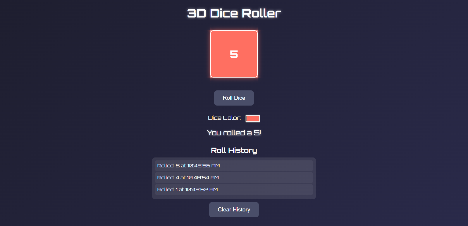
Have you ever needed a virtual dice for a board game but couldn't find a real one? Or perhaps you're developing a game that requires random number generation with a visual component? Today, I'll walk you through creating an interactive 3D dice roller with roll history tracking using HTML, CSS, and JavaScript. This project is perfect for beginners looking to strengthen their front-end development skills while creating something both functional and visually appealing. 🎲
What We're Building
Our virtual dice roller features:
A realistic 3D dice that animates when rolled
Custom dice color selection
Roll history that tracks all your results
Clean, responsive UI with a futuristic design
Simple controls that work on both desktop and mobile
You can try the finished application here: 3D Dice Roller
Let's dive into how it all works! 💻
Project Structure
Before jumping into the code, let's understand the structure of our project:
Copy3D-Dice-Roller/
│
├── index.html      # Main HTML structure
├── styles.css      # Styling and animations
└── script.js       # Interactive functionality
Setting Up the HTML Structure
First, we'll create the basic structure of our application. The HTML provides the skeleton that defines all the elements we'll style and manipulate.
<!DOCTYPE html>
<html lang="en">
<head>
    <meta charset="UTF-8">
    <meta name="viewport" content="width=device-width, initial-scale=1.0">
    <title>3D Dice Roller</title>
    <link rel="stylesheet" href="styles.css">
    <link href="https://fonts.googleapis.com/css2?family=Orbitron:wght@400;700&display=swap" rel="stylesheet">
</head>
<body>
    <div class="container">
        <h1>3D Dice Roller</h1>
        <div class="dice-wrapper">
            <div class="dice-container">
                <div id="dice" class="dice">
                    <div class="face front">1</div>
                    <div class="face back">2</div>
                    <div class="face right">3</div>
                    <div class="face left">4</div>
                    <div class="face top">5</div>
                    <div class="face bottom">6</div>
                </div>
            </div>
        </div>
        <button id="roll-btn" class="roll-btn">Roll Dice</button>
        <div class="color-picker">
            <label for="dice-color">Dice Color: </label>
            <input type="color" id="dice-color" value="#ff6f61">
        </div>
        <div id="result" class="result"></div>
        <div class="history">
            <h2>Roll History</h2>
            <div id="history-list" class="history-list"></div>
            <button id="clear-history" class="clear-btn">Clear History</button>
        </div>
    </div>
    <script src="script.js"></script>
</body>
</html>
Let's break down the key components:
We're using the Orbitron font from Google Fonts, which gives our app that futuristic feel
The
.dice-containerprovides perspective for our 3D diceThe dice itself has six faces, each representing a side of the die
We've included a color picker that allows users to customize the dice color
A history section tracks previous rolls
Styling with CSS
Now let's make our dice roller look amazing with CSS. We'll create a sleek dark interface with glowing elements and smooth transitions.
* {
    margin: 0;
    padding: 0;
    box-sizing: border-box;
}

body {
    font-family: 'Orbitron', sans-serif;
    background: linear-gradient(135deg, #1e1e2f, #2a2a4a);
    color: #fff;
    min-height: 100vh;
    display: flex;
    justify-content: center;
    align-items: center;
}

.container {
    text-align: center;
    padding: 20px;
    max-width: 600px;
    width: 100%;
}

h1 {
    font-size: 2.5rem;
    margin-bottom: 20px;
    text-shadow: 0 0 10px rgba(255, 255, 255, 0.5);
}

.dice-wrapper {
    display: flex;
    justify-content: center;
    align-items: center;
    margin: 40px 0;
}

.dice-container {
    perspective: 1000px;
}

.dice {
    width: 150px;
    height: 150px;
    position: relative;
    transform-style: preserve-3d;
    transition: transform 1s ease-out;
}

.face {
    position: absolute;
    width: 150px;
    height: 150px;
    background: #ff6f61; /* Default color */
    border: 2px solid #fff;
    border-radius: 10px;
    display: flex;
    justify-content: center;
    align-items: center;
    font-size: 2rem;
    font-weight: bold;
    color: #fff; /* Default text color */
    box-shadow: 0 0 15px rgba(255, 111, 97, 0.7);
}

/* Face positions for a true 3D cube */
.front  { transform: translateZ(75px); }
.back   { transform: translateZ(-75px) rotateY(180deg); }
.right  { transform: translateX(75px) rotateY(90deg); }
.left   { transform: translateX(-75px) rotateY(-90deg); }
.top    { transform: translateY(-75px) rotateX(90deg); }
.bottom { transform: translateY(75px) rotateX(-90deg); }

/* Stable states maintaining 3D structure */
.show-1 { transform: rotateX(0deg) rotateY(0deg); }
.show-2 { transform: rotateX(0deg) rotateY(180deg); }
.show-3 { transform: rotateX(0deg) rotateY(-90deg); }
.show-4 { transform: rotateX(0deg) rotateY(90deg); }
.show-5 { transform: rotateX(-90deg) rotateY(0deg); }
.show-6 { transform: rotateX(90deg) rotateY(0deg); }

/* Rolling animation */
@keyframes roll {
    0% { transform: rotateX(0deg) rotateY(0deg); }
    100% { transform: rotateX(720deg) rotateY(720deg); }
}

.rolling {
    animation: roll 1s ease-out forwards;
}

.roll-btn, .clear-btn {
    padding: 15px 30px;
    font-size: 1.2rem;
    border: none;
    border-radius: 10px;
    background: #4a4e69;
    color: #fff;
    cursor: pointer;
    transition: transform 0.2s, background 0.3s;
    margin: 10px;
}

.roll-btn:hover, .clear-btn:hover {
    transform: scale(1.05);
    background: #5c627d;
}

.color-picker {
    margin: 20px 0;
}

.color-picker label {
    font-size: 1.2rem;
    margin-right: 10px;
}

#dice-color {
    vertical-align: middle;
    cursor: pointer;
}

.result {
    margin: 20px 0;
    font-size: 1.5rem;
    text-shadow: 0 0 5px rgba(255, 255, 255, 0.8);
}

.history {
    margin-top: 30px;
}

h2 {
    font-size: 1.5rem;
    margin-bottom: 10px;
}

.history-list {
    max-height: 200px;
    overflow-y: auto;
    background: rgba(255, 255, 255, 0.1);
    border-radius: 10px;
    padding: 10px;
}

.history-item {
    padding: 8px;
    margin-bottom: 5px;
    background: rgba(255, 255, 255, 0.05);
    border-radius: 5px;
    text-align: left;
    font-size: 1rem;
}
The CSS does several important things:
Sets up a dark gradient background for a futuristic appearance
Positions the 3D dice using CSS transforms to create each face
Defines the dice rolling animation
Creates stylish, interactive buttons with hover effects
Designs a clean history display with scrolling capability
Makes everything responsive for various screen sizes
The 3D Dice Magic ✨
The most fascinating part of our CSS is how we create a 3D cube using CSS transforms. Each face of the dice is positioned in 3D space using transform: translateZ() and rotations.
The trick to showing specific dice faces is having preset transform classes (.show-1, .show-2, etc.) that position the cube to display the correct face toward the user. For example, to show the "1" face, we use:
.show-1 { transform: rotateX(0deg) rotateY(0deg); }
Adding Interactivity with JavaScript
Finally, let's make our dice roller functional with JavaScript:
const dice = document.getElementById('dice');
const rollBtn = document.getElementById('roll-btn');
const result = document.getElementById('result');
const historyList = document.getElementById('history-list');
const clearBtn = document.getElementById('clear-history');
const colorPicker = document.getElementById('dice-color');
const faces = document.querySelectorAll('.face');

let rollHistory = [];

function rollDice() {
    rollBtn.disabled = true;
    result.textContent = '';

    dice.classList.remove('show-1', 'show-2', 'show-3', 'show-4', 'show-5', 'show-6');
    dice.classList.add('rolling');

    const rollResult = Math.floor(Math.random() * 6) + 1;

    setTimeout(() => {
        dice.classList.remove('rolling');
        dice.classList.add(`show-${rollResult}`);
        result.textContent = `You rolled a ${rollResult}!`;
        addToHistory(rollResult);
        rollBtn.disabled = false;
    }, 1000);
}

function addToHistory(result) {
    const timestamp = new Date().toLocaleTimeString();
    rollHistory.unshift({ result, timestamp });
    updateHistoryUI();
}

function updateHistoryUI() {
    historyList.innerHTML = rollHistory.map(item => `
        <div class="history-item">Rolled: ${item.result} at ${item.timestamp}</div>
    `).join('');
}

function clearHistory() {
    rollHistory = [];
    updateHistoryUI();
}


function adjustTextColor(bgColor) {
    const rgb = hexToRgb(bgColor);
    const brightness = (rgb.r * 299 + rgb.g * 587 + rgb.b * 114) / 1000;
    const textColor = brightness > 128 ? '#000' : '#fff';
    faces.forEach(face => face.style.color = textColor);
}


function hexToRgb(hex) {
    const r = parseInt(hex.slice(1, 3), 16);
    const g = parseInt(hex.slice(3, 5), 16);
    const b = parseInt(hex.slice(5, 7), 16);
    return { r, g, b };
}


function updateDiceColor(color) {
    faces.forEach(face => {
        face.style.background = color;
        face.style.boxShadow = `0 0 15px ${color}`;
    });
    adjustTextColor(color);
}

rollBtn.addEventListener('click', rollDice);
clearBtn.addEventListener('click', clearHistory);
colorPicker.addEventListener('input', (e) => updateDiceColor(e.target.value));
Our JavaScript handles several key functions:
1. Rolling the Dice 🎲
The rollDice() function:
Disables the roll button temporarily to prevent multiple clicks
Removes any previous "show" classes
Adds the rolling animation class
Generates a random number between 1 and 6
After animation completes, displays the result and adds it to history
2. Managing Roll History 📜
The addToHistory() and updateHistoryUI() functions:
Record each roll with a timestamp
Update the UI to display the history list
Store results in an array for easy management
3. Customizing Dice Color 🎨
The updateDiceColor() function:
Updates the background color of all dice faces
Adjusts the glow effect to match the selected color
Calls
adjustTextColor()to ensure text remains visible
4. Intelligent Text Color Adjustment
One particularly clever feature is the automatic text color adjustment:
javascriptCopyfunction adjustTextColor(bgColor) {
    const rgb = hexToRgb(bgColor);
    const brightness = (rgb.r * 299 + rgb.g * 587 + rgb.b * 114) / 1000;
    const textColor = brightness > 128 ? '#000' : '#fff';
    faces.forEach(face => face.style.color = textColor);
}
This function calculates the brightness of the background color and sets the text to either black or white depending on which will be more visible. This ensures good contrast regardless of the dice color chosen by the user.
How the Pieces Work Together
When a user clicks the "Roll Dice" button:
The JavaScript triggers the rolling animation
A random number is generated
After the animation completes, the dice displays the correct face
The result is shown below the dice and added to the history
The timestamp is recorded alongside the result
If the user wants to customize the dice, they can use the color picker, which immediately updates the dice appearance while maintaining readability.
Potential Enhancements
This project is a great foundation, but there are many ways you could extend it:
Add support for different types of dice (D4, D8, D20, etc.)
Implement sound effects for rolling
Add the ability to roll multiple dice simultaneously
Create a "roll stats" feature showing most frequent results
Allow users to save favorite dice configurations
Conclusion
Building this 3D dice roller teaches several important front-end development concepts:
Creating 3D objects with CSS transforms
Managing application state with JavaScript
Building smooth animations and transitions
Creating an intuitive and responsive user interface
Implementing color theory for dynamic contrast
The best part is that this entire app works client-side with no dependencies, making it easy to host anywhere or incorporate into other projects.
Now you have your own virtual dice roller that you can use for games, decision-making, or just for fun! Feel free to experiment with the code and make it your own. Happy coding! 🚀
Resources for Learning More
If you enjoyed building this project, here are some topics you might want to explore next:
Advanced CSS animations and transitions
3D transformations in CSS
JavaScript event handling
Color theory and dynamic UI adjustments
Local storage for persisting history between sessions


